

Look, every time I think I’ve finally cracked the code—stick to neutrals, be safe with navy, don’t embarrass yourself—bam, here comes dusty olive or “warm taupe” and suddenly everyone’s buying shirts that look like they were cut from my grandma’s drapes. Soft pastels and these weirdly specific neutrals like taupe and dusty olive are supposed to be the hot ticket for 2025, if you believe Standard Style and Brit+Co. And then—wait, petal pink? Digital lavender? “Saturated greens?”—people are apparently stampeding for these, and sales numbers are blowing last year’s spring out of the water. I mean, how do we all wake up needing a powder pastel jacket at the same time? Is there a memo I missed?
Stylists keep telling me “toned-down versions” will rescue my tired closet. Rescue it from what? Boredom? Laundry day? It’s a paradox—muted is bold now? Emily Russell—yeah, she’s everywhere—tells Brit+Co that a dash of retro blue or apple red is all I need. But I walk past shop windows and it’s like a pastel explosion, only everything’s weirdly calm, like the fashion world’s terrified of actual color. Honestly, I’m mostly annoyed that half these “new” shades look like the paint chips I rejected for my bathroom.
Why Trending Colors Are Redefining Closet Staples
How did burgundy get replaced by apple red everywhere, and why am I suddenly buying colors I’d have called boring a year ago? The industry just keeps cranking out these color waves. It’s not just “what’s hot”—it’s a total reshuffle of what counts as a staple, and sometimes it feels completely random. Last month, terracotta sweaters were the thing; now it’s deep blue trenches. “Timeless,” they say, but it all feels like déjà vu.
The Evolution of Fashion Trends
What drives me nuts: those “timeless essentials” get a face-lift overnight because someone in Paris woke up and decided olive green is classic now (I still regret that one olive blazer from 2019). Ten years ago, it was all about white tees and beige trenches; now, rich terracotta and bold blue are “must-haves,” and neutrals are apparently in timeout. Pantone says 72% of designers pick a different “anchor color” every year. For what reason? Not always a good one.
Staples used to mean black, navy, white, tan. Now it’s like, if you’re not chasing velvet jewel tones or “mysterious blue” hoodies, you’re out of the loop. Supposedly, these staples evolve with our “collective mood.” But let’s be real: half the time, it’s just retailers needing a new sales bump. My tailor, who hates trends, told me, “Fashion repeats, but color cycles are way faster since social media.” Makes sense. Six months ago it was all muted earth; now, closets are full of “sustainable nostalgia.” Whatever that means.
The Role of the Fashion Industry in Color Innovation
Scrolling through runway recaps, I keep seeing “color innovation” everywhere. But is anything actually new? Yeah, designers push saturated reds, deep blues, even licorice black. But a lot of this is cooked up by market research, not wild creative types. A 2024 BoF report says color forecasting is mostly data analytics and rapid-fire A/B tests online.
Every showroom is obsessed with tactile finishes—velvet, matte lacquer—matched with colors that are supposed to feel like “luxurious calm.” My friend works in a textile lab; she says brands use secret tech to fake vintage dyes. Her team’s always trying to make “old” colors feel exclusive again. Genius or manipulative? Both. Drop a “limited edition” teal and suddenly everyone wants it.
Big retailers chase this by commissioning their own exclusive shades for spring. You spot two brands with nearly identical moss-green jackets? They probably argued about Pantone chips at some convention. The industry wants color cycles fast enough to keep us buying but stable enough to make us loyal. So every “essential” in my closet starts to feel like a temporary guest.
Consumer Psychology: The Draw of the Unexpected
I’ll admit it: nothing gets me to buy a third pair of loafers like seeing the right shade of pink on Instagram. Psychologists say novelty gives us a dopamine hit, and yeah, I start picturing my life transformed by citrus yellow—until it looks terrible in real life. The Fashion Retail Academy claims 60% of shoppers get “excited” by colors they never even planned to buy.
Brands are all over this, swapping colors so fast you can’t get bored—except when last week’s apple red suddenly feels too much for work. Ever impulse-bought a bold green blouse and regretted it after a single Zoom? Same. Staples don’t shift from neutrals to brights because we all changed our minds. It’s psychological games, powered by trend platforms and influencers who move so fast you don’t even notice your “go-to” is already old news.
So when everyone says they buy for “timelessness,” I’m watching carts fill up with the same new shades. It’s more about emotion than logic, and sometimes even the designers can’t explain it—except to mumble something about “the method.” Next season, maybe all my button-ups have to be licorice black, and we’ll do this dance again.
Breaking Down the Current Color Palette
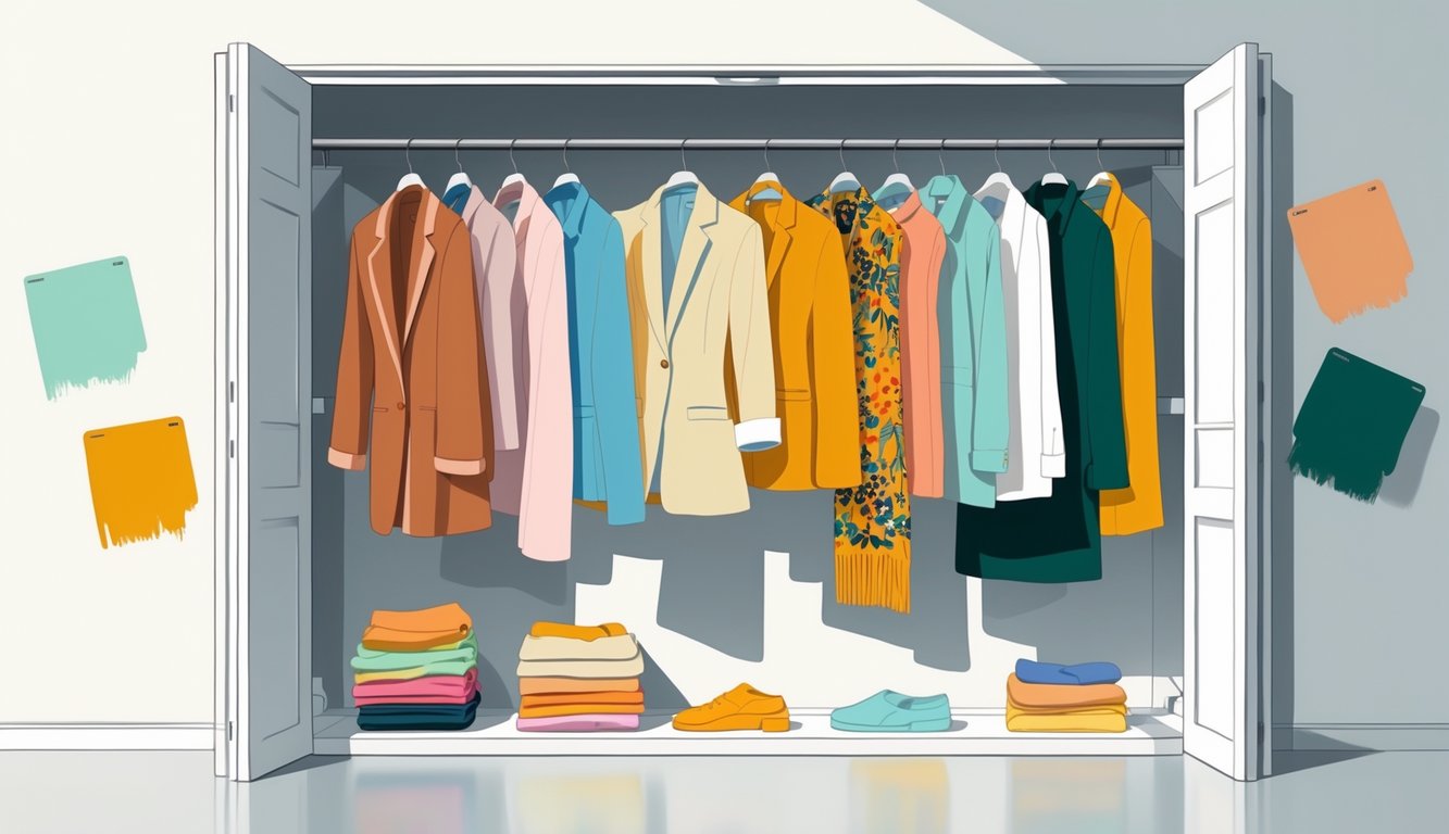
Spring arrives, I stare at my shoes, and suddenly everything old feels washed out next to these butter yellows, soft blues, and deep browns crowding the shelves. Even the big brands are pushing palettes that ripple across closets and Instagram, making my beige bag feel ancient before I’ve even used it twice.
Emerging Earth Tones and Neutrals
Client meetings lately? It’s all sandy, taupe, or clay shades—somewhere between “barely there” and “I spilled coffee on this.” Boring? Maybe. But Sherwin Williams’ Color Marketing Group claims these earth tones bring “quiet luxury,” and suddenly, “classic” means something totally different.
Nobody actually says “buy six browns,” but the racks are full of them. Comforting browns, utilitarian pieces, muted olives—everywhere. A fashion buyer told me, “There’s a cult around matte mushroom.” Subtle, but it cuts through trend fatigue. Just when I think I’m done with caramel jackets, a khaki bomber jumps three sizes on the trend charts.
Gray used to feel sterile. Now everyone pairs it with cocoa and camel. Faux minimalism, maybe? The pale base lets the wild stuff pop, and even if it’ll never go viral, these neutrals anchor the craziest color-blocked thing you own.