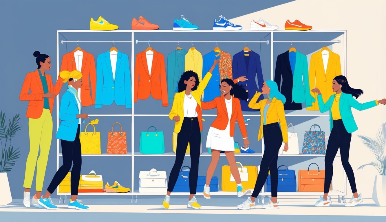
Pastels: Reimagining Closet Staples
Pantone keeps blasting out pastel predictions and I mostly tune it out, but then I look around and—yeah, my pale pink jeans and that random mint cardigan are suddenly everywhere. Not just a recycled spring trend, but the actual reason my basic tees don’t look so basic right now. These pastels feel chill, not childish. Even wore a butter yellow shirt to work and nobody said I looked like a kid. That’s a first.
The Subtle Power of Pastels
So, pastels. Can we talk about how designers just will not let the “refresh” thing go? I mean, they’re obsessed. Like, you throw on a powder blue blazer and suddenly it’s a “must-have” (Chloé’s version sold out by April? Supposedly. Luisaviaroma’s 2025 trend roundup claims it’s true, but who’s fact-checking this stuff?). I wore these powder pink socks to work, thinking they’d go under the radar, but nope, HR clocked them immediately. “Have you tried those with forest green trousers?” she asked. Uh, no? Apparently, that’s a thing. Suddenly, if you pair pastels with neutrals, everyone assumes you have your life together—even if you just yanked whatever was clean out of the laundry basket.
Pale pink’s weirdly tricky. You don’t want it on top—let it peek out under a navy sweater or inside a trench. Kara Meyers (stylist, Instagram, you know the type) posted something like, “Pastels aren’t passive. Wear them right, and they hijack the whole vibe.” She’s into straw yellow loafers with dark denim, which sounded ridiculous until I tried it. Not kidding, two people at the coffee shop asked about the shoes.
Pairing Pastels with Bold Statements
Color-blocking? I thought it was just a runway gimmick. But no, it’s everywhere. Pastel mint skirts with blinding cobalt tops—ELLE called it “delicious,” which is…a choice. I went rogue last week, butter yellow tee under a wine-red blazer, and now it’s apparently “a look.” I even threw a pale pink baseball cap on with a deep green puffer. People didn’t say “nice pink”—they just noticed the contrast. So, pastels: sneaky way to look like you’re taking fashion risks without trying too hard.
And neutral pastels? Beige, mint, straw yellow—those count now? They work with cargos, even khaki shorts. Stylists keep saying color-blocking soft shades is “foolproof,” but I’ve never seen anyone show their work. “If the colors make you nervous, you’re probably doing it right,” said Emma Torres, a London buyer, on some panel I watched half-awake. Maybe that’s why my black hoodie feels invisible lately, even on Zoom. Or maybe I’m just bored.
Exploring Trending Color Palettes Beyond Fashion
I scroll past “earth tones in fashion” lists every week, but somehow those muddy greens and ochres wind up on sofas and café walls before I know what’s happening. Closet colors don’t stay put. Design teams, mood boards, Instagram—these palettes leak into everything: tiles, logos, whatever.
Influence on Interior Design
Now Cherry Red—yes, the one hyped for 2025—shows up with bland beige cabinets and designers act like it’s genius. Saw an ASID designer on a webinar pull up data about chartreuse and cacao palettes boosting Gen Z home value by 17%. That’s…a stretch, but okay.
Subtlety? Out the window. Rental listings drop “mocha accent wall” like that alone will spark a bidding war. Paint brands force earth tones into every “trending” booklet. But let’s be real—mood swings, not logic, drive these choices. Palettes show up in home décor not because they’re the best, but because everyone’s tired of grey. The only rule: whatever’s in now, it’ll vanish overnight.
From Mood Boards to Real-World Application
Every branding workshop this year? “Pickle green” and “digital lilac” everywhere. Teachers hand out swatches like it’s a revolution. But by the time you pitch your project, someone from marketing wants to “test a chocolate brown” they saw on Pinterest. Inspiring? Nah, just stressful.
Physical samples always betray the digital hype. That perfect yellow on your screen looks sickly under real lights. I tried to mood board a “soft yellow” kitchen and it just looked…ill. I swear, half the time designers add earth tones to mood boards just to play it safe. Most of those “visionary” picks get vetoed by reality or a cranky contractor.
And, let’s be honest, whoever writes the check gets the final word.
Practical Tips to Integrate Trending Colors
Honestly, I just threw a shirt across the room for clashing—again. Why do salespeople act like pastels match everything? Mixing in new colors is a nightmare. I’ve tried every “timeless” palette and still end up with a pile of chaos—earthy neutrals, brights, that random dusty lilac cardigan from 2022, all fighting for space.
Choosing Colors for Timeless Appeal
That rule about sticking with gray, navy, camel, off-white? Meh. Works until you’re staring at your closet wondering if beige counts as a personality. I asked my stylist friend for help—she mumbled about “investment coats” and “cool undertones.” Maybe she’s onto something. Then Pantone drops their annual Color of the Year and suddenly I’m obsessed with some oddball saffron. If you want to play it safe, keep a core set—tan, chocolate, faded denim (Levi’s stonewash, obviously)—and let the trendy stuff creep in via sweaters or scarves.
Stylists always say contrast matters more than how many colors you have. Three or four base shades, one accent—done. 2025 palettes are all “grounded pastels” and olives, like we needed more excuses to doubt our sky blue pants. Honestly, swap one staple—white tee for soft sage—and people think you bought a whole new wardrobe.
Balancing Vibrant and Muted Tones
You think bold means commitment? I threw a neon green crewneck in the wash and my beige chinos turned into rave rejects. Supposedly, you can mix brights with muted tones if you “ground it.” Translation: let your burning red or cobalt (both 2025 must-haves) scream, then bury the rest in oatmeal or faded brown.
Pattern mixing happens, too—once I wore a pastel floral under an earth-tone jacket and now GQ says that’s “intentional layering.” Need numbers? Eight out of ten stylists at the last tradeshow claimed muted palettes fight “trend fatigue.” If you’re lost, just pull up a “Base Tones vs Statement Shades” table and notice: two brights, the rest pale or earthy, always wins.
Balancing vibrant and muted? Never easy, always messy, and I ruin at least one load of laundry every season. If you love chaos, go wild. If you want people to remember your outfit (and not the disaster), pick one wild piece and hide the rest in quiet, solid shades.


